Eau Claire Taps Local Designer for New City Logo

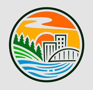
This week, the City of Eau Claire rolled out a brand new city logo designed by RT Vrieze of the local design firm Knorth Studios, which features woods, water, open spaces, big skies, buildings, and bridges. The city’s previous logo was drawn up nearly 20 years ago by Brian Amundson, who worked for the city for 25 years as an engineer and public works director before retiring in May 2013. So the main spirit of this new look is to reflect the city’s remarkable evolution in the time since. Now, at the dawn of a new decade, this new logo hopes to encapsulate the spirit of this place with one iconic image.
Here's what Vrieze had to say about the thought process going into this project:
"The most challenging and fun part of the logo process for us is the research. For example, we asked younger and older generations what they think of when they think of Eau Claire? We had so many different answers. Ultimately, we found all the answers to be very colorful. So we knew we needed the logo to be vibrant and full of life. The next step was to choose which elements to use within the logo; a sunset, a valley, pine trees, rivers, buildings, and of course the new walk bridge at the Confluence. We used almost all rounded edges for all the natural elements within the logo and squared edges for the human-made elements (bridge and buildings). Our biggest fear was/is for older demographics to feel that it's too big of a change and that it doesn't accurately represent Eau Claire. We understand that change can be a hard transition sometimes, so in order for that change to be a little less dramatic, we paid homage to the original logo, designed by City of Eau Claire Engineer Brian Amundson, and included the two buildings, rolling hill, and trees from the original logo. We felt it was important to include the new Confluence walk bridge as a representation of the future of Eau Claire.
It's been an honor to be able to create a logo for the city we call home, this was a special project for us as a company and we can't wait to see how people react to it. Personally, to be able to create a logo that a community can choose to stand behind and have it be a symbol of pride they have for their city is really special to me. It goes beyond graphic design at that point. I hope people grasp onto it and take ownership of it, it was made for them."


