Antlered Intimidation
when it comes to emulating a pro team’s logo, how far it too far?

In our modern world of smartphones and computers, we rely on icons to easily identify something we enjoy, be it an app, a game, a news source or a favorite sports team. Sports logos make for great icons: They are meant to be immediately associated with our fave franchise or college, the image we associate with our guys. Unlike the middle of the 20th century, when intricate hand-drawn sketches were the norm, modern sports iconography is meant to simply convey a message or a feeling, and they especially need to look cool.
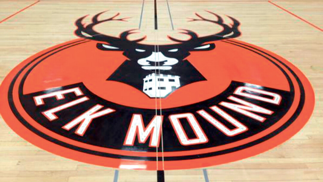
Funny that we find ourselves in 2015 with the new Bucks logo checking off all the aforementioned ideal traits. After all, look at how the people at Elk Mound High School reacted: They put the logo on their court – wait, the Bucks logo? Aren’t they the Mounders?
Such was the saga that began with an emulation of the new hot thing in Badger State athletics, led to a viral journey through the likes of sports snark sites like Deadspin, and ended with something completely different on the hardwood. We here in the Chippewa Valley got our taste of what has spread through the sporting world in the social media era, and got a whole lotta takes – even a few #hottakes – on tributes and permission and creativity.
We here in the Chippewa Valley got our taste of what has spread through the sporting world in the social media era, and got a whole lotta takes – even a few #hottakes – on tributes and permission and creativity.
The Milwaukee Bucks have not been cool in western Wisconsin in any year I can recall; if they were, either I was not yet born, too young or lived elsewhere. Only since new owners Wes Edens and Marc Lasry bought the franchise last year has the organization consistently found a way to force our attention. They have made the proper hires, drafted the right players, marketed the team statewide, coerced approval of a new area, designed awesome new uniforms (hello again, Irish Rainbow!) and came up with a revamped logo that mostly avoided an “angry Buck.” Associating oneself – or one’s school – with the Bucks is now to be desired.
So thought officials at Elk Mound, making elk-appropriate tweaks to the main logo and painting it in Mounder orange and black on their new court – this was a tribute. Then it was tweeted to the Twitterverse … and in came the comments from sports websites across America, the essence of most being, “Way to rip off the Bucks logo before they even put it on their court.” The Bucks did not seem to have much of a problem, really – after all, this must mean their statewide marketing is working – but the NBA might be a different story, and it was: their legal team advised a change.
 There are good people who work in the Elk Mound School District, and they got flak from folks they will never meet saying that they did the wrong thing in not asking permission in the first place. And, yes, they should have put in such a request. Perhaps they would not have gotten such attention had the court logo not been tweeted, but you know someone at some game this season – maybe a player, or a student, or someone who thought “Wow, check this out!” – would’ve done the same thing, and the controversy would have happened this winter rather than this summer (the exception being the Bucks would have played on their newly logoed court by then).
On the other hand, logo imitation is rampant among high schools and colleges. My Memorial Old Abes softball team had the Montreal Expos logo on their caps in the 1980s and ’90s; my elementary school (Arlington Heights) copied the Philadelphia Eagles image in the ’80s. Grambling State and the University of Georgia have Packer-esque “G”s (albeit with permission), and I could spend a couple more columns listing similar examples. The more-recent rise in copying and emulation may stem from Photoshop’s ability to make re-creation easy – though paralleling that, a Google search can also bring an easy cease-and-desist order.
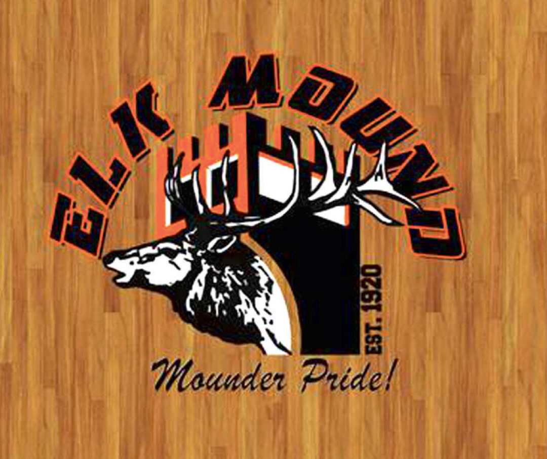
The end result was a burst of Chippewa Valley creativity: The replacement logo features an actual elk orienting out of the Elk Mound Hill observation tower, the school’s date of establishment on the side. This is iconic of Elk Mound. It may not be as cool, but it feels right. And it might even look good on your smartphone.


