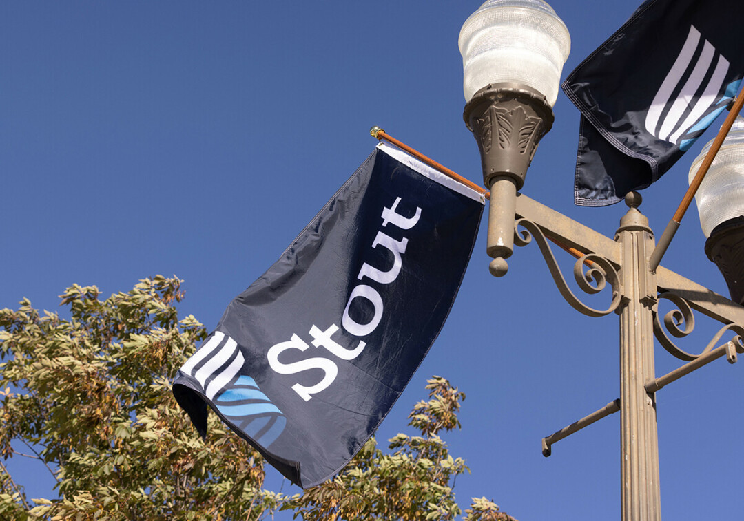
‘S’-pressing Themselves: UW-Stout Unveils Dynamic New Logo
Menomonie university to phase in new logo this year
Jerry Poling / UW-Stout Communications |

In 1923, two UW-Stout students won a school song contest by writing “Alma Mater.” The third line of the lyrics, “With tower high and brilliant ‘S,’ ” highlighted imagery instantly familiar to those attending the university. The song has endured, as have the Clock Tower and the proud “S” that hangs from it.
One hundred years later, a brilliant new “S” has been chosen as the university’s new logo. With three parallel bands and three tiers rising flame-like, it represents a university with a proud past and a bright future.

“The new mark traces the path of innovation through our past and present and illuminates our future. It honors our three educational tenets: applied learning, career focus, and collaboration,” Chancellor Katherine Frank said.
The effort coincides with goals and initiatives related to UW-Stout’s FOCUS2030 strategic plan. One of five goals within the plan includes advancing the university’s polytechnic reputation. UW-Stout has had numerous symbols over the years, many featuring a version of the “S.” The new “S” represents students, faculty and staff who are constantly innovating and growing and a university that is boldly striving to serve Wisconsin and society, in part through a strong bond to business and industry.
The logo was designed by Simpson Scarborough, a Virginia-based firm that has helped brand numerous universities, such as Butler, Creighton, Fordham and Northwestern, as well as other polytechnic universities, such as Cal-Poly.


