Leinenkugel’s Will Retire Native American Logo

Following in the footsteps of brands ranging from the Land O’Lake to Washington’s now-mascotless NFL team, the Jacob Leinenkugel Brewing Co. says it plans to drop Native American imagery from its logo.
As reported by multiple media outlets over the weekend, company President Dick Leinenkugel issued a statement explaining that the imagery would be replaced between now and next year:
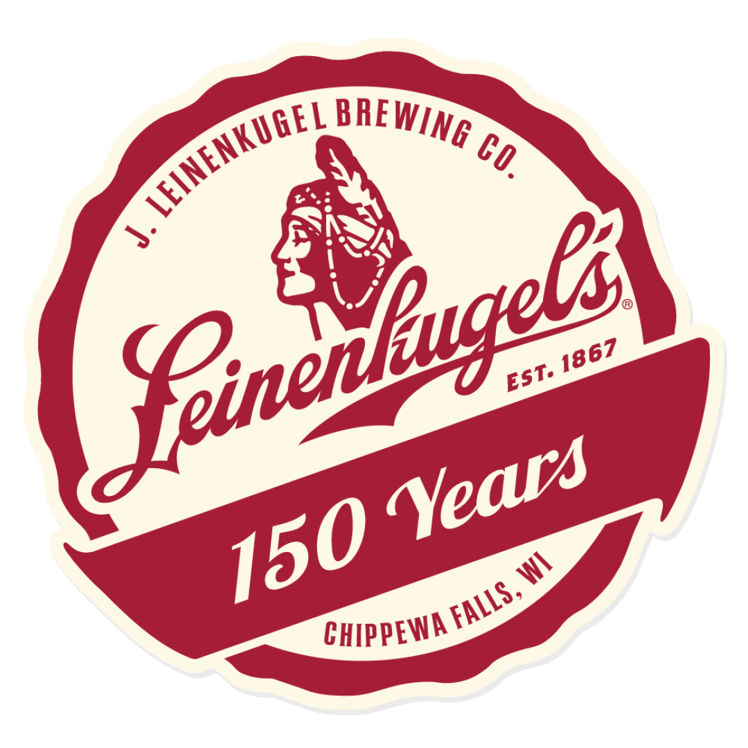
“Over the past several months, our team has been working on an initiative to update the overall look and feel of Leinenkugel’s, and among several changes, we have ultimately made the decision to retire the symbol of the Native American woman that we have previously used with the brand. In the coming months, we will begin to replace our existing creative with new imagery, and will continue to make these changes through 2021. Everything, from our beers and packs to merchandising and marketing, will be re-worked with new graphics that pay tribute to our brewery’s home in Chippewa Falls, but in a different, reimagined way.” – Dick Leinenkugel
While the brewery’s namesake – and Dick’s great-great-grandfather – began brewing beer in Chippewa Falls 1867, the current logo dates back to the 1930s. According to the company’s website:
The Native American Indian who graces our label is a symbol of the rich heritage of our area. Leinenkugel’s has been brewed in Chippewa Falls, Wisconsin, for over 145 years. The Santee Sioux and Ojibways were the area’s first native settlers. Chippewa Falls also lies in the heart of what is called the Indian Head Country. The Indian Head area was so named because the border of the northwest corner of Wisconsin forms the profile of an Indian. We’ve featured the Native American Indian on our label since the 1930s as a tribute to this special area that is rich in Indian history.
According to an article originally published in the Chippewa Herald newspaper in 1992 to celebrate the brewery’s 125th anniversary, “the friendly face had become a simple symbol of the mystical spring water and the rich brewing process that produced the beer.”
“Originally it was felt that with a name like Chippewa Pride, it wouldn’t mean much without an Indian on our label,” former brewery President Bill Leinenkugel, who died in 2008, said in the 1992 article. “This is the beer that was coming from the area known as the ‘Indianhead’ part of the state. It seemed appropriate that an Indian’s head should grace the bottles of beer coming from Chippewa Falls.”

While the Leinenkugel family is still involved in the brand, the company was purchased by Miller Brewing in 1987, which later became MillerCoors. Now it’s part of the multinational Molson Coors Beverage Co. What was once a regional brand is now available nationwide, with its Summer Shandy distributed in all 50 states.
“Everything, from our beers and packs to merchandising and marketing, will be re-worked with new graphics that pay tribute to our brewery’s home in Chippewa Falls, but in a different, reimagined way,” Dick Leinenkugel said in the company announcement.
While the statement doesn’t address the motivations behind the change, it is only the latest in a series of decisions by brands across the United States to stop using logos and mascots that include people of color. In February, Minnesota-based Land O’Lakes quietly dropped the Native American “butter maiden” from its packaging.
After the death of George Floyd while in custody of Minneapolis police in May, the trend accelerated, with Quaker Oats announcing it was retiring its Aunt Jemima brand of pancake mix and the Washington Redskins dropping their long-criticized logo and nickname. (For the coming season, the NFL franchise will simply be known as the Washington Football Team.) Likewise, the corporate owners of Uncle Ben’s rice, Mrs. Butterworth’s syrup, and Cream of Wheat porridge have reportedly said their mascots and packaging are being reconsidered.

